Okta’s Redesigned End User Dashboard - Now 50% Faster!
You’ll often hear our CEO and co-founder, Todd McKinnon, talk about how our mission at Okta is to connect users to their technologies. An important part of how we do this is through the Okta End User Dashboard, a modern web portal that makes it simple and secure for end users to quickly get access to their applications.
With a single click, users can log into any of their enterprise or personal applications without the need to remember all of their different app URLs, usernames, or passwords. It can be accessed from any web browser, allowing the Dashboard to be device, location, and network agnostic. Millions of people authenticate against Okta every single day, and many go to the Okta End User Dashboard first. It’s a critical part of the end-user experience that we take great care in designing.
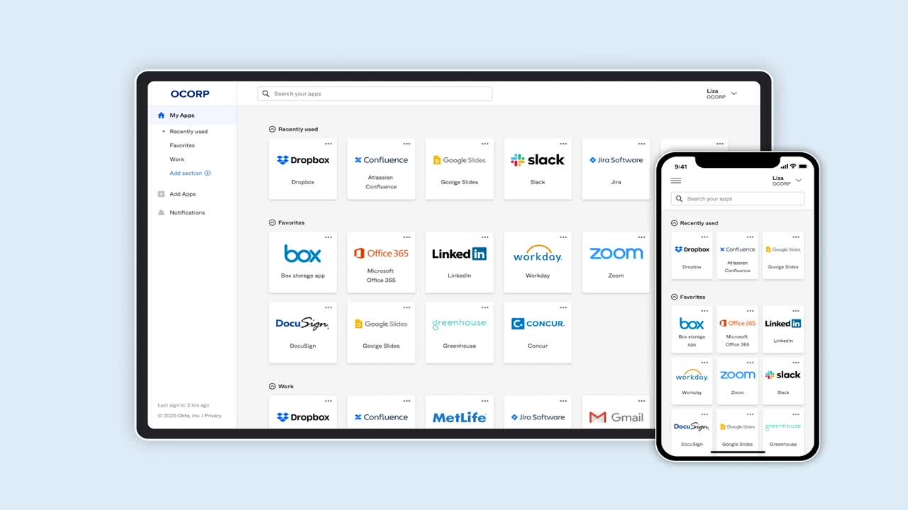
That’s why we’re very excited to announce our biggest redesign of the Okta End User Dashboard since 2014! It’s easier to navigate, more mobile friendly, and loads 50% faster than our previous Dashboard. Here’s what’s new:
New side navigation design
Our redesign starts with creating a new side-navigation panel, which sets the foundation for a more scalable and versatile design. Not only does it make getting around the Dashboard more intuitive, it also better aligns with other modern enterprise apps that you're probably already familiar with.
Updated app cards
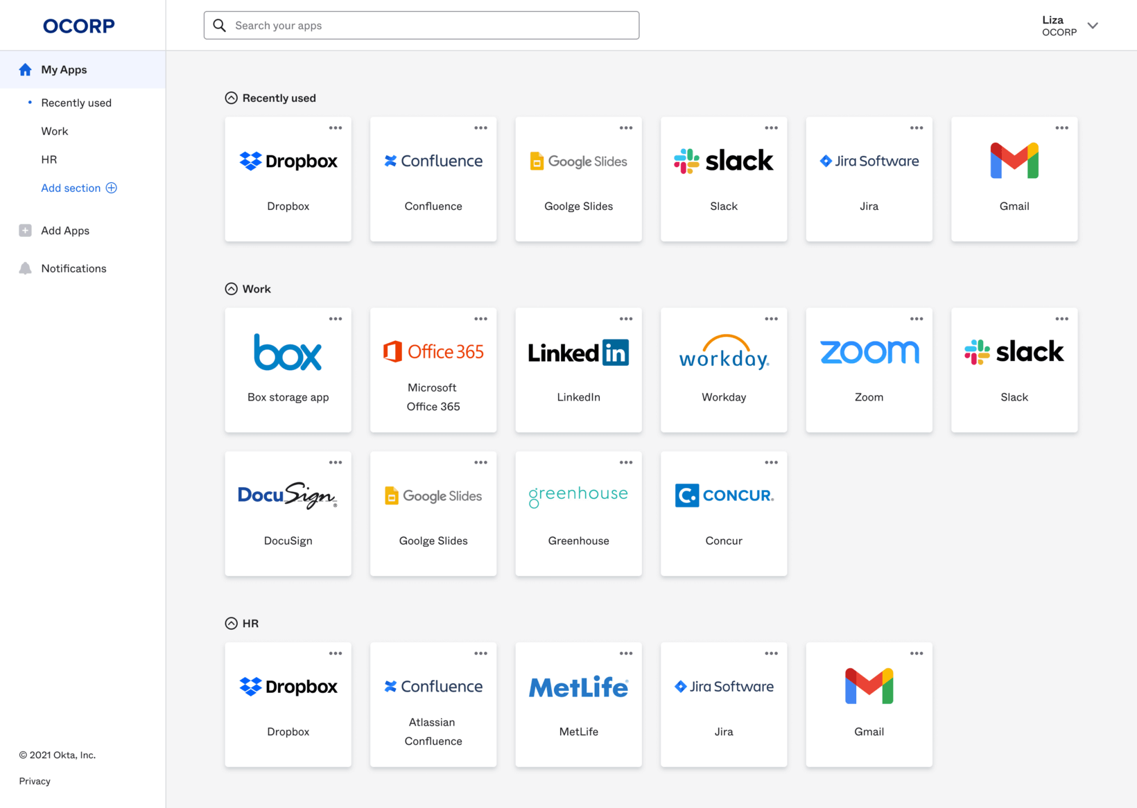
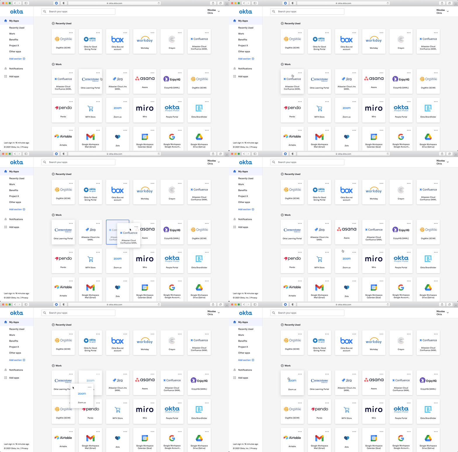
Unofficially (and lovingly) referred to as “chiclets” by some of our long-time customers, the app cards represent the various applications that a user has access to. We’ve enlarged the card and added more information within each card to make them more useful. Everything related to the application is contained within the card, so it’s easy to find and work with. Just like the old design, you can still drag and drop the cards to customize the look of your Dashboard.
Search is now fuzzy
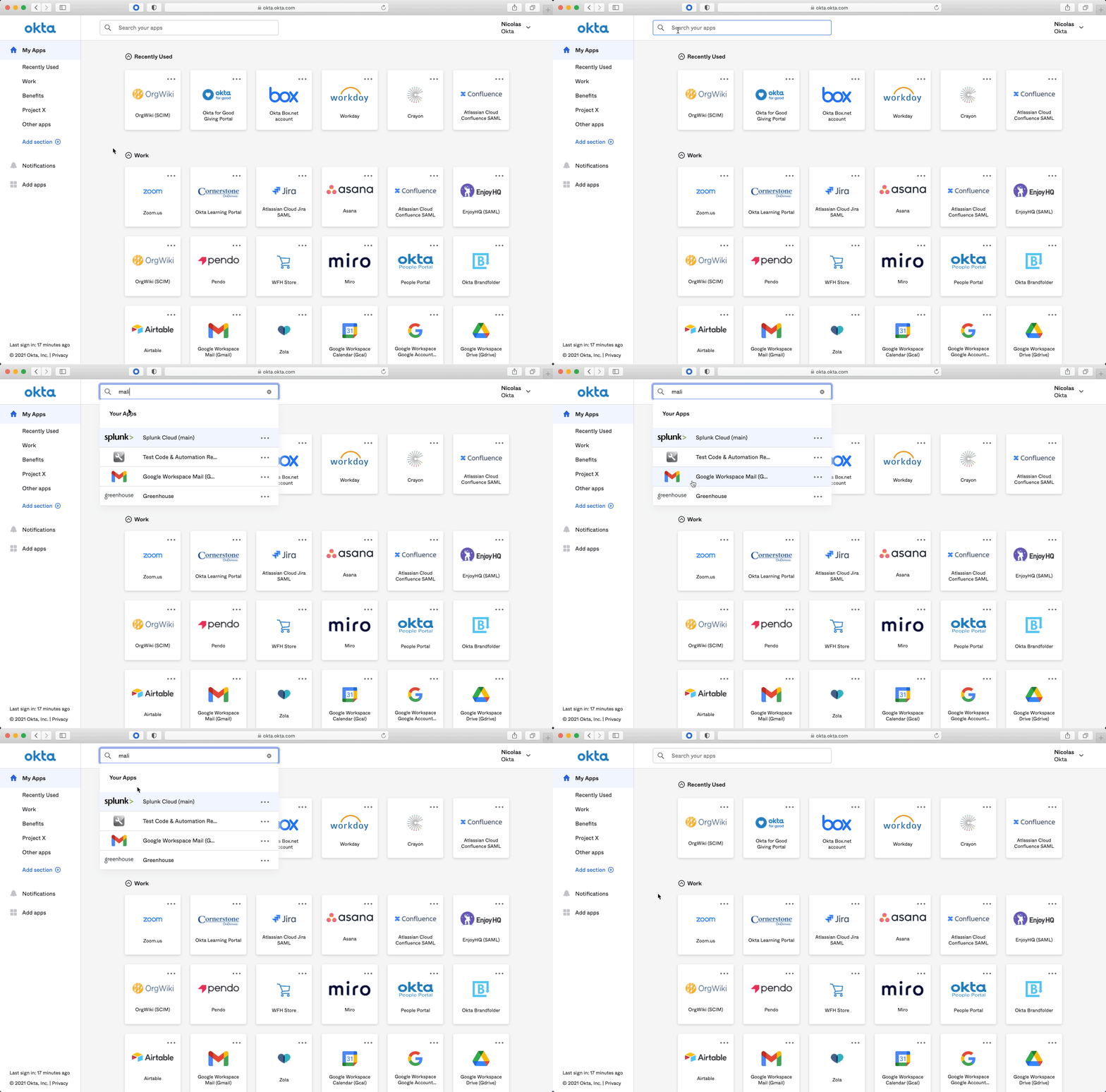
With the average Okta user assigned over 80+ applications, it can be difficult to quickly get to the exact app you’re looking for - especially if you don’t remember the exact name of that app. Now, we’ve made the search algorithm more forgiving. We’ll find it, even if you don’t enter the exact app name.
Sections are the new tabs
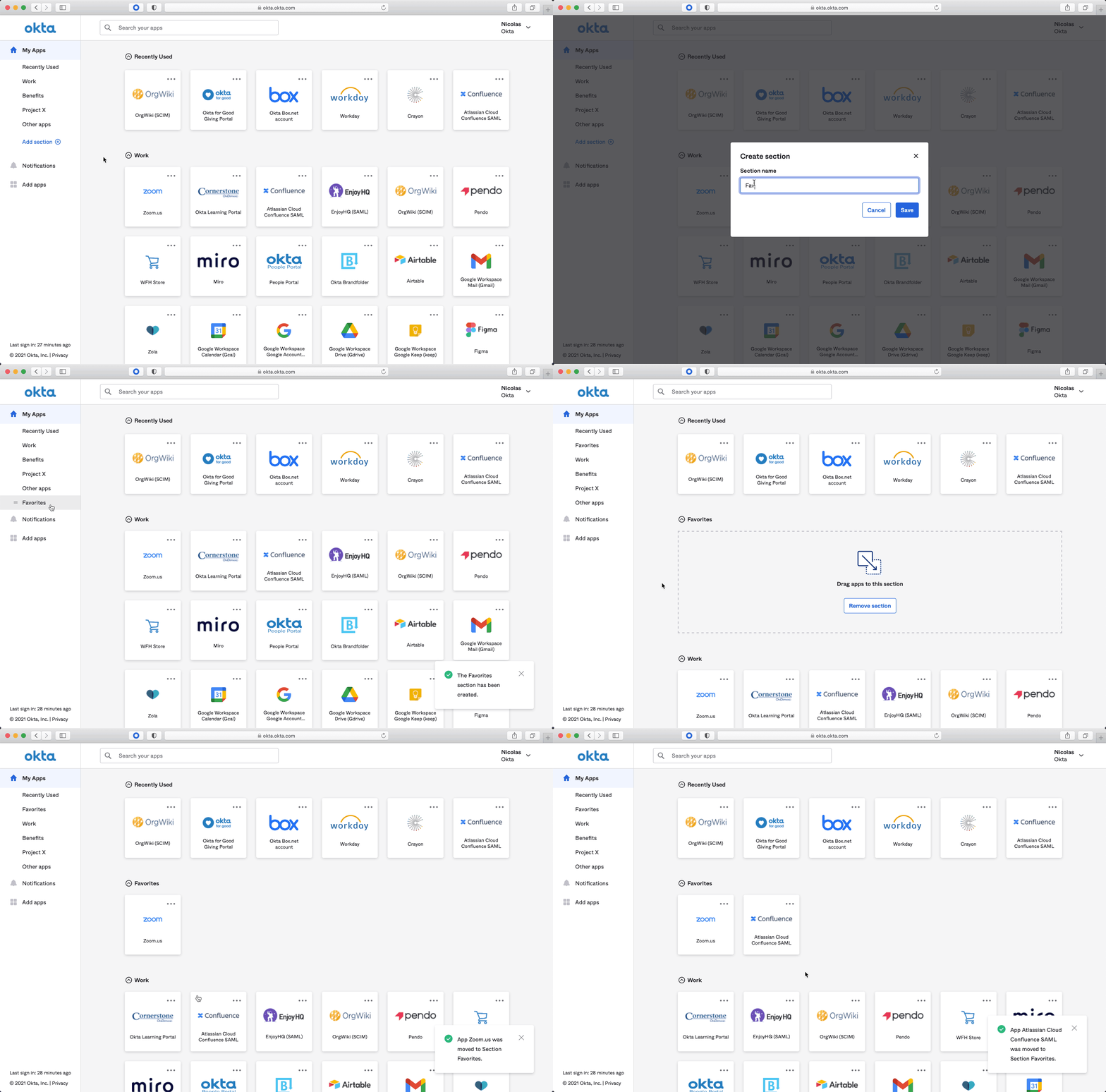
We used to have a concept of “tabs”, which users created to organize and group their cards. We’ve reimagined it as “sections”, which better fits into the single-page Dashboard view. You can still create customized sections such as “Personal” or “Favorites” and move cards into those sections for easier navigation.
Don’t forget the browser plugin
We didn’t just update the End User Dashboard, we also updated the Okta Browser Plugin! Available on all common browsers including Chrome, Firefox, Safari, IE, and Edge, the Okta Browser Plugin is a browser extension that syncs to your Dashboard and allows you to launch apps without going directly to it. I personally use it more often than my Dashboard because I don’t need to open up a new browser tab!
Available now in General Availability (GA)
Like what you see? Good news! As of April 2021, the redesigned Okta End User Dashboard and Browser Plugin are both available in General Availability. That means you can turn it on in your preview and production tenants today! We’ve enabled group rollout so you don’t need to turn it on for everybody all at once. There’s no need to reconfigure any settings or reupload any images—we’ll port everything over to the new design, including existing tabs!
Need some help to prepare communications for your end-users? Check out our End User Adoption Toolkit, which has templates that can help you roll out the new experience. We even have a detailed project plan template to help you manage the rollout!
Look here to learn more about Okta’s End-User Experience.


